Radio Button
Radio Button allows you to filter based on single items selection in a group. To configure a radio button, a minimum requirement of 1 column is needed.
How to configure the flat table data to Radio Button?
The following procedure illustrates data configuration of Radio Button.
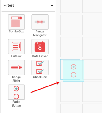
Drag and drop Radio Button control icon from the Tool box into design panel. You can find control in Toolbox by search.
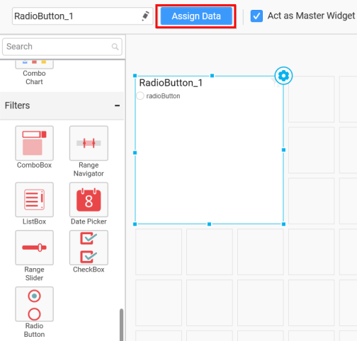
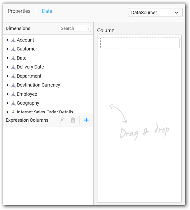
After control added in design panel, click Assign Data button at Design Tools Pane to open the Data configuration pane.
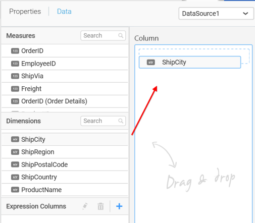
Bind column through drag and drop element from sections to Column section.
You can select the settings to sort the data either Ascending or Descending.
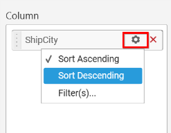
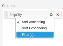
You can use the filters by selecting the Filter(s)… option to rank the elements.
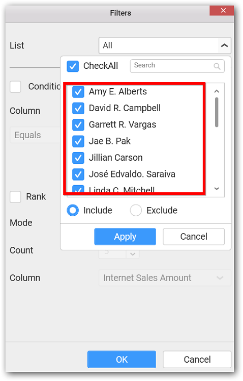
You can select the specific city to filter the element and CheckAll is used either to check all the data or to select the specific data. Include and Exclude is used to include and exclude the elements by selecting the radio button and click the Apply button.
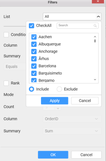
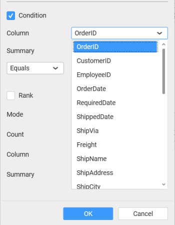
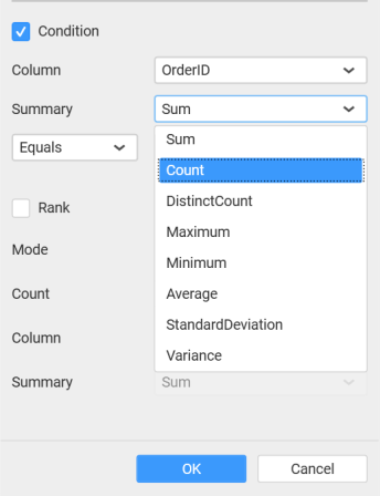
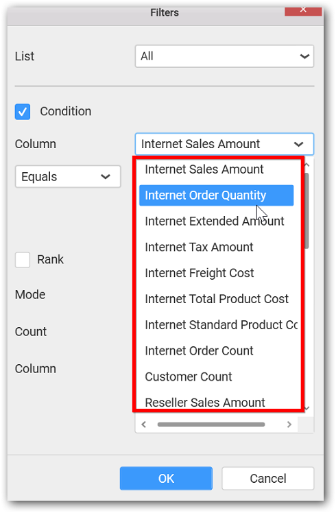
You can select the Condition option to change the Column elements and *Summary type by selecting the required column name and summary type.
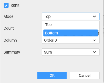
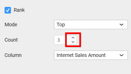
You can select the Rank option to enable filters and select the Mode either top or bottom.
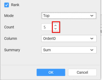
You can change the Count value to filter the top elements and change the column and summary type as required and click OK button.
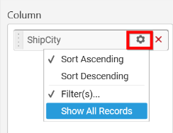
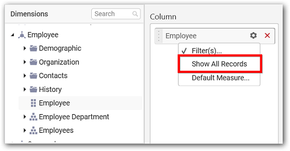
You can clear the filters by selecting the Show All Records option.
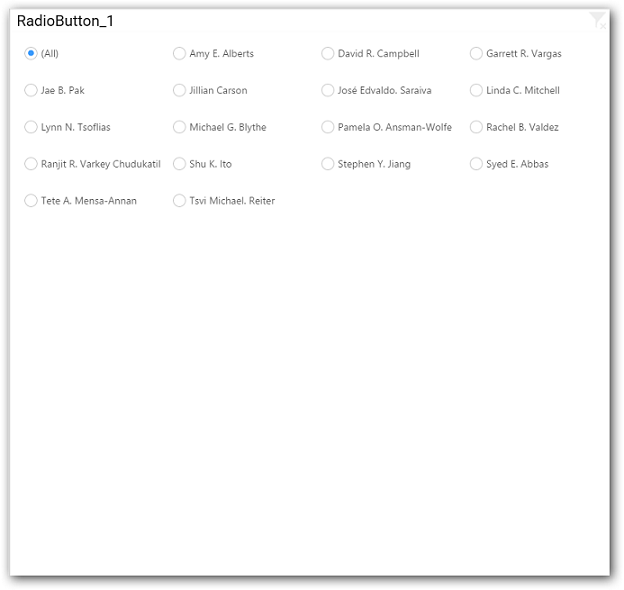
Here is an illustration,
How to configure the SSAS data to Radio Button?
Following steps illustrates configuration of SSAS data to Radio Button.
Drag and drop the Radio Button widget into canvas and resize into your required size.
Select the dropped widget using mouse.
Click the Assign Data button in the toolbar.
A Data pane will be opened with available Dimensions.
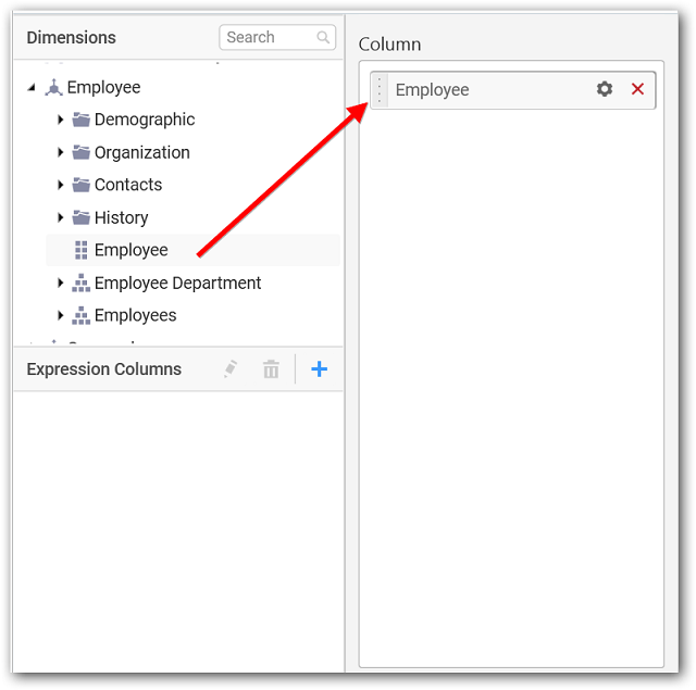
Add a dimension level or hierarchy into Column(s) section through drag and drop.
Define filter criteria through Filter(s)… menu item in the Settings drop down menu.
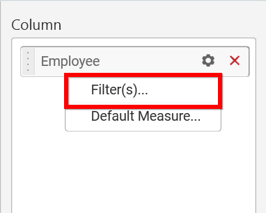
Select Filter(s)… to launch the Filters window.
Define the filter Condition and Rank and Click OK.
To show all records again click on Show All Records.
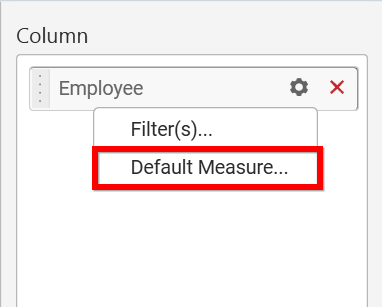
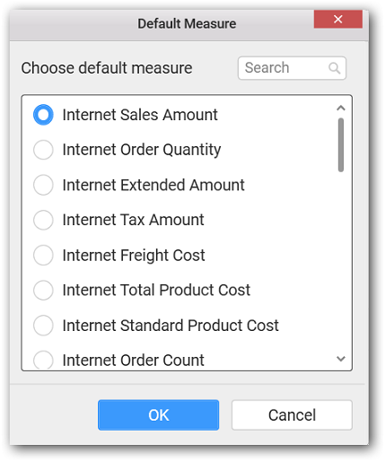
You can add default measure to the dropped dimension to retrieve exact result for that dimension.
Here is an illustration,
How to format Radio Button?
You can format the Radio Button for better illustration of the view that you require, through the settings available in Properties pane.
General Settings
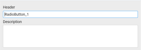
Header
This allows you to set title for this radio button widget.
Description
This allows you to set description for this radio button widget, whose visibility will be denoted by i icon, hovering which will display this description in tooltip.
Basic Settings
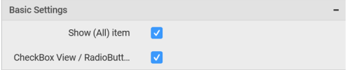
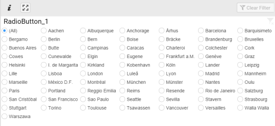
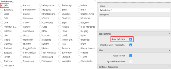
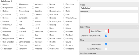
Show (All) item
This allows you to enable selection or deselection of entire items by adding All item.
Radio Button with Show All
Radio Button without All
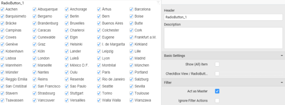
CheckBox View/RadioButton View
This allows you to change the view of the widget to checkbox.
Radio Button as Check Box View
Filter Settings
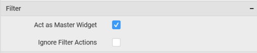
Act as Master Widget
This allows you to define this radio button widget as a master widget such that its filter action can be made to listen by other widgets in the dashboard.
Ignore Filter Actions
This allows you to define this radio button widget to ignore responding to the filter actions applied on other widgets in dashboard.
Container Appearance
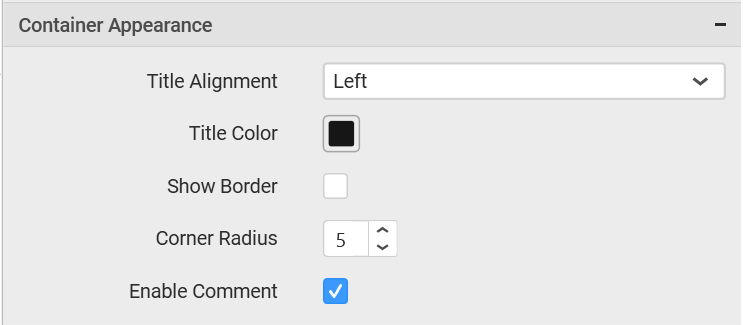
Title Alignment
This allows you to handle the alignment of widget title to either left, center or right.
Title Color
This allows you to apply text color to the widget title.
Show Border
This allows you to toggle the visibility of border surrounding the widget.
Corner Radius
This allows you to apply the specified radius to the widget corners. Value can be between 0 and 10.
Enable Comment
This allows you to enable/disable comment for dashboard widget. For more details refer here