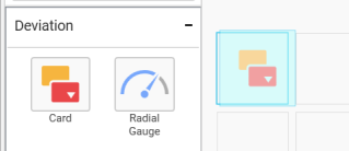
Card
Card allows you to measure trends through key performance indicators (KPIs) like Value and Goal.
How to configure flat table data to Card Widget?
To showcase a card, a minimum requirement of 1 actual and/or target value is needed.
The following procedure illustrates data configuration of Card.
Drag and drop Card control icon from the Tool box into design panel. You can find control in Toolbox by search.
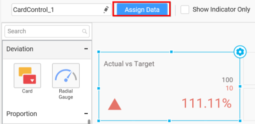
After control added in design panel, click Assign Data button at Design Tools Pane to open the Data configuration pane.
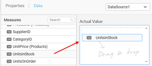
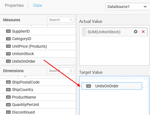
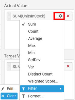
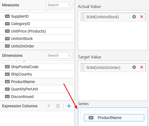
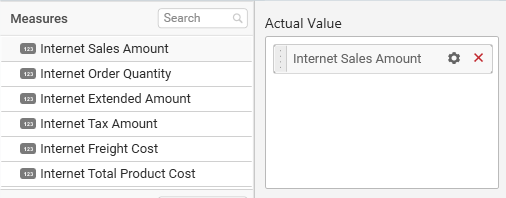
Bind column through drag and drop element from Measures section to Actual Value.
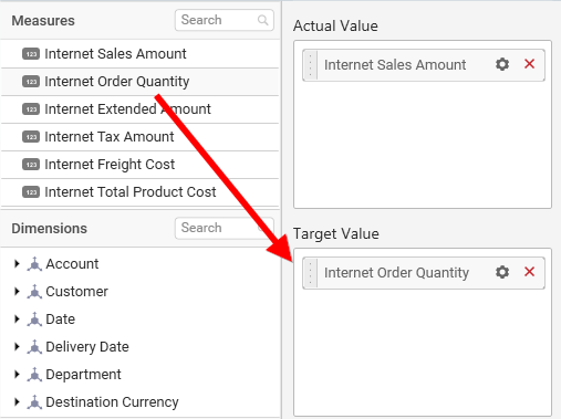
Drag and Drop the elements to Target Value.
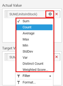
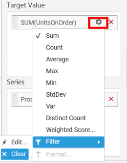
You can use aggregate function to change the Actual Value of the card.
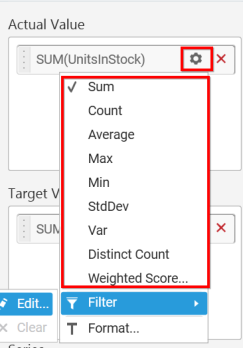
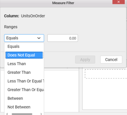
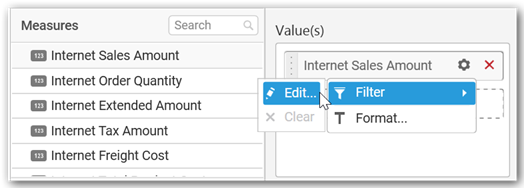
You can use Filter option to filter the data by specifying the filter condition.
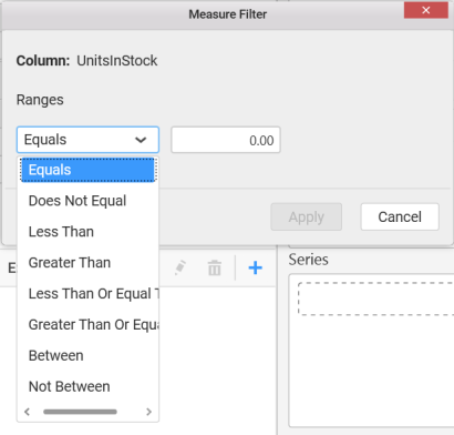
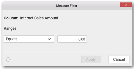
Measure Filter window will be shown to set the Ranges.
You can clear filter by selecting the Clear option for Actual Value.
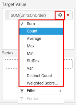
You can the change the Target value by selecting aggregate function.
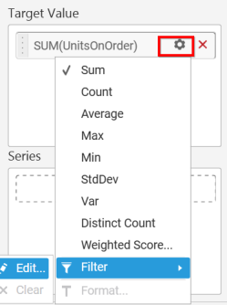
You can use Filter option to filter the data by specifying the filter condition.
You can clear filter by selecting the Clear option for Target Value.
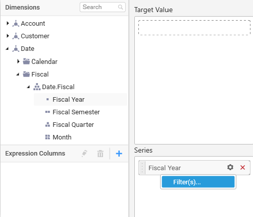
Drag and Drop the elements from sections to Series.
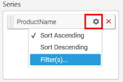
You can change the Series value of the card by changing the setting.
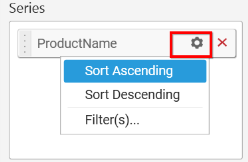
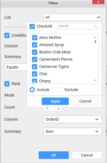
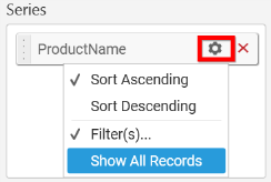
You can use the filters by selecting the Filter(s)… option to rank the elements.
You can select the specific country to filter the element and CheckAll is used either to check all the data or to select the specific data. Include and Exclude is used to include and exclude the elements by selecting the radio button and click the Apply button.
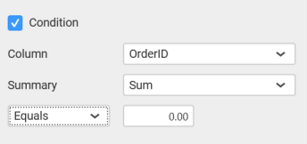
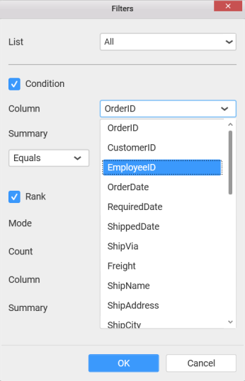
You can select the Condition option to change the Column elements and Summary type by selecting required column name and summary type.
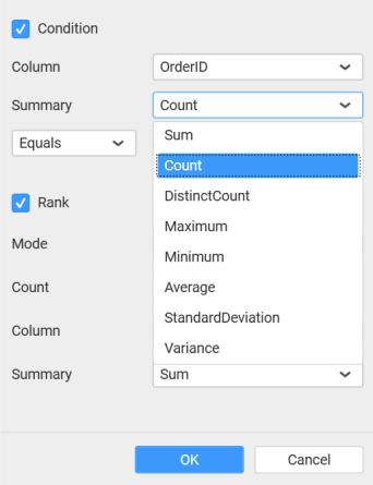
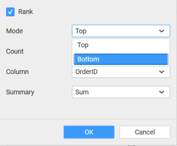
You can select the Rank option to enable filters and select the Mode either top or bottom.
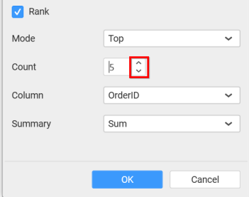
You can change the Count value to filter the top elements and change the column and summary type as required and click OK button.
You can clear filter by selecting Show All Records for Series section.
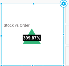
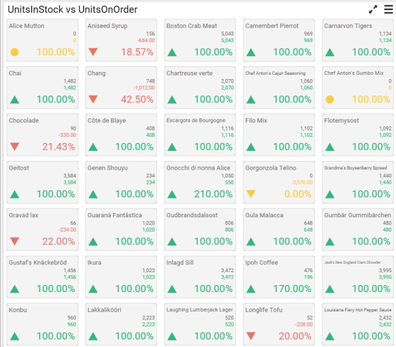
Here is an illustration,
How to configure SSAS data to Card Widget?
To showcase a card, a minimum requirement of 1 actual and/or target value is needed.
Following steps illustrates configuration of SSAS data to Card.
Drag and drop Card control icon from the Tool box into design panel. You can find control in Toolbox by search.
After control added in design panel, click Assign Data button at Design Tools Pane to open the Data configuration pane.
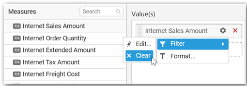
Drag and drop a column under Measures category into Actual Value.
Drag and drop a column under Measures category into Target Value.
Define the filter criteria to match through choosing Edit option in Filter menu item.
The Measure filter dialog will be shown where you can choose the filter condition and apply the condition value.
Select Clear option to clear the defined filter.
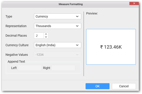
Select Format option to define the display format to the values in the column through Measure Formatting window.
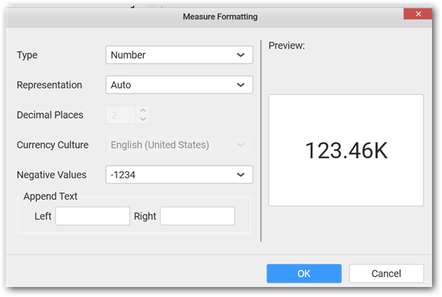
Choose the options you need and click OK.
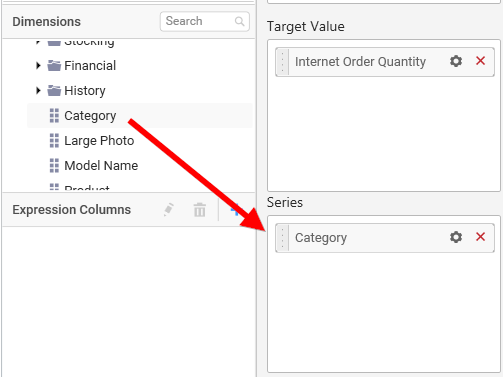
Add a dimension level or hierarchy into Series section through drag and drop.
Define filter criteria through Filter(s)… menu item in the Settings drop down menu.
To know more about filters, refer here.
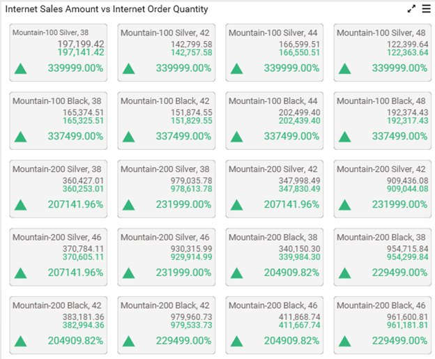
Here is an illustration,
How to format Card Widget?
You can format the card for better illustration of the view that you require, through the settings available in Properties pane.
General Settings
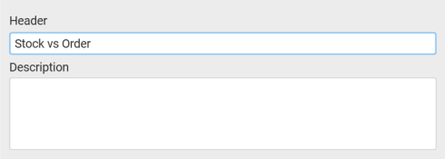
Header
This allows you to set title for this card widget.
Description
This allows you to set description for this card widget, whose visibility will be denoted by i icon, hovering which will display this description in tooltip.
Basic Settings
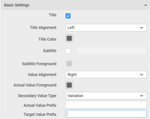
Title
You can set a custom name as card title.
Title Alignment
The title can be aligned left, center, or right.
Title Color
The color of title text can be customized.
Subtitle
A sub title can be added to the card control providing a suitable text. Subtitle text will be displayed at the bottom of the title text.
Subtitle Foreground
The text color of subtitle text can be customized.
Value Alignment
You can customize the text alignment. This option will be disabled when Show Indicator Only option was enabled.
Actual Value Foreground
You can customize the color of card value. This option will be disabled when Show Indicator Only option was enabled.
Secondary Value Type
This allows you to set the Secondary Value Type based on the Variation and Target Value.
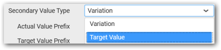
Actual Value Prefix
This allows you to set the actual value prefix.
Target Value Prefix
This allows you to set the target value prefix.
Behavior Settings
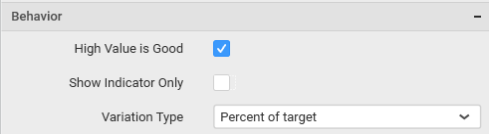
High Value is Good
The card visualization can be customized through specifying whether higher value should be treated as good or bad.
Show Indicator Only
Enabling this allows you to show indicator representation alone in card. This option will be available only if columns are added to both Actual Value and Target Value sections.
Variation Type
This allows you to customize the data showcased in card control by switching the Variation types to either Absolute, Percent of Target, or Percent of Difference.
Filter Settings
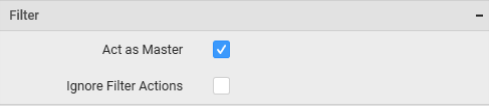
Act as Master
This allows you to define this grid widget as a master widget such that its filter action can be made to listen by other widgets in the dashboard.
Ignore Filter Actions
This allows you to define this grid widget to ignore responding to the filter actions applied on other widgets in dashboard.
Link Settings
You can enable linking and configure to navigate either to a published dashboard URL or to a general URL with or without parameters. For more details, refer Linking.
Container Appearance
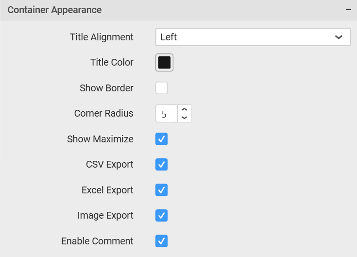
Title Alignment
This allows you to handle the alignment of widget title to either left, center or right.
Title Color
This allows you to apply text color to the widget title.
Show Border
This allows you to toggle the visibility of border surrounding the widget.
Corner Radius
This allows you to apply the specified radius to the widget corners. Value can be between 0 and 10.
Show Maximize
This allows you to enable/disable the maximized mode of this card widget. The visibility of the maximize icon in widget header will be defined based on this setting. Clicking this icon in viewer will show the maximized view of the grid widget.
CSV Export
This allows you to enable/disable the CSV export option for this card widget. Enabling this allows you to export the summarized data of the widget view to CSV format.
Excel Export
This allows you to enable/disable the Excel export option for this card widget. Enabling this allows you to export the summarized data of the widget view to XLSX format.
Image Export
This allows you to enable/disable the image export option for this card widget. Enabling this allows you to export the view of the widget to image format (*.JPG) in viewer.
Enable Comment
This allows you to enable/disable comment for dashboard widget. For more details refer here